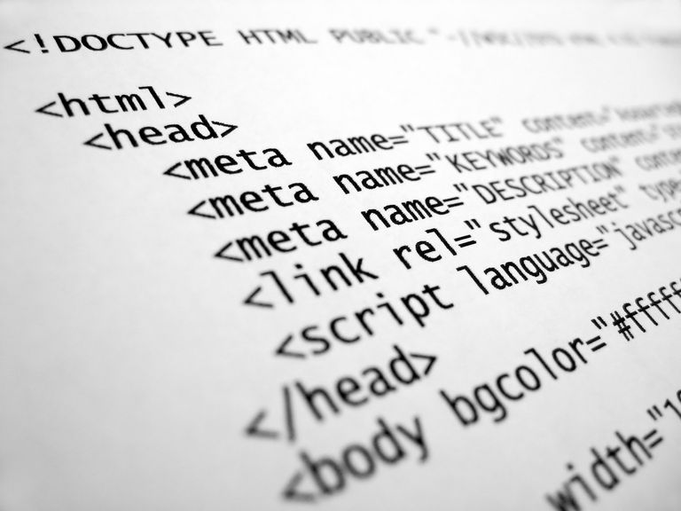
Hypertext Markup Language, or HTML, is the markup language underpinning most sites today. Despite its introduction being almost 25 years ago, the standard has undergone numerous major revisions and has acquired several new HTML features in its lifetime. The most recent of these is HTML5, which was standardized in 2014. It already powers the new wave of content aiming to replace the aging, insecure Adobe Flash Player browser plugin system some sites still cling to.
Despite this, HTML continues to evolve, and with that, we present a selection of 10 of the best new HTML features coming soon. Along with that, we’ll advise on which of your favourite browsers will (soon) support the feature, courtesy of this great site. When reading the browser support images under each feature, the numbers in each column indicate successive browser version numbers, with the lowest row being the currently available versions. Green blocks mean the browser supports this feature, light green means partial support, whilst red is no current support for the feature, although it may be in development.
-
A new JPEG
The Joint Photographic Experts’ group is getting a new edition to its standards today! JPEG 2000 (extension *.jp2) is apparently much more effective in compression than its venerable JPEG sibling, and XML transparency can also be embedded into the metadata for the image. Bafflingly, only Apple’s Safari and iOS Safari made the cut to support the new jp2 format for now.
-
WebRTC
This one will arguably drive the biggest change from an end-user’s perspective, as WebRTC allows native voice and video calls in your browser instead of the associated app or plugin. Along with voice and video, messaging is also possible with WebRTC sans plugin. Firefox and Chrome, as well as the plucky contender, Opera, are first out of the gates to support this standard.
-
Agnostic Pointer Events
Anyone with a touch-screen on their laptop/tablet will appreciate the merging of how browsers understand a click versus a swipe or a touch, for example. The specification says touchscreen, mice, and pen touches are all to be consolidated and provide cross-device pointer authoring. Just IE and Edge support this one right now.
-
Position: Sticky
This one fixes a deficiency previously solved by Javascript, which allows (in CSS) items such as a horizontal menu bar on a web site to scroll up as the user scrolls, but then stick to the top of the screen once the user has scrolled far enough. The best way to explain this effect is to observe it in action; simply visit this site and scroll down (and watch how the top bar menu responds). sticky{ position: sticky; } should do the trick here. Only Safari and Firefox support Sticky for now.
-
Grid Layout
If you’ve ever used Android home-screen launchers, and tried to add a widget to your homescreen, have you ever noticed you find yourself restricted to a set grid? The “fixed points” define the extent of the widget size you’re making, and Grid Layout is like this for CSS, where a grid is used to allow for more predictable content layout. While it sounds great, only Internet Explorer and MS Edge sort of support it at this time.
-
Font Stretch
This option lets browsers automatically choose the best font variation to use for fonts that come out-of-the-box with variations for character width. This will be important for responsive web design and similar applications. IE and Edge lead the pack with current support, with Firefox also joining the party.
-
CSS Mask
This option masks contents on a page to show only the desired element. The concept is similar to that of a mask on Photoshop, where you can selectively tune colour and object visibility. Partial support for most browsers already exists, except from the Microsoft camp where neither IE or Edge support it yet.
-
Image-Set
When designing sites for a myriad of screen sizes and resolutions, it often pays to have multiple image assets available for each screen resolution, so that there are no weird issues with assets on your page being cut off, or conversely, too pixelated with high PPI screens. This Image-Set method lets your browser do the guesswork by automatically choosing the correct asset for the screen PPI from a given set of assets. Again, the Microsoft camp as well as Firefox are mum on this; Chrome, Safari and Opera meanwhile, have capitalised and support the feature.
-
Dialog(ue)
The “dialog” tag lets your browser annoy the user with front-and-centre displaying dialogue boxes. Whilst it’s arguable that browsers already have it, this method lets those dialogue boxes be custom-designed, and allow the background dimming element to be customized. Only Chrome and Opera support this right now.
-
MIDI
While the idea was as old as the hills, the MIDI file is actually a Web MIDI API, so that coders have a base to start with, on getting musical devices using the MIDI standard to play nice with browsers. Penetration is weak so far though, only Chrome and Opera support this at present.
Don’t forget that to learn more about this and other technical programming terms, follow Hyperion Hub developments in the future, and comment with any feedback you may have on these and other articles hosted here.