

A responsive top navigation menu is the cornerstone of a webpage. Without it, we would just blindly navigate web pages to find what we want. That would increasingly become a problem when there are topics nested in sub-topics nested in sub-topics.
For example, you’re looking for a specific brand of laptop online, and you decide to visit the website of a particularly large store, that sells everything from furniture to clothing. You, however, don’t care about anything else besides the laptop. A “search” function could be useful to quickly find exactly what you are looking for. But what if you only know the vague details but don’t know the specific name of the laptop you want? A general category like “Tech and Gadgets” would be really useful in finding what you want. Enter the navbar….
When the word “navigation” or “navbar” is brought up in a conversation in the context of a web page, the picture that pops into your head is likely a top navigation or “topnav”. The reason for this is likely that most of the companies’ web-pages that we visit almost always include a topnav. They seem to pull it off so effortlessly and, most importantly, the experience across devices(Desktop, tablet and mobile) seems so smooth and uniform. The average user can have confidence that, for any given website, they can have an easy experience on almost any device. This is due to the “Responsiveness” factor. That, or the company has spent quite a hefty budget on building different views for different devices.
This tutorial is aimed at beginners to junior developers, who want to learn how to build a responsive top navigation menu and gain a strong grasp of the related concepts.
We will walk you through a specific implementation of the navbar, and you can further customise it from there.
Why not use a framework such as Bootstrap?
As a developer, you’ve probably heard of frameworks such as Bootstrap, which would have built-in, out of the box responsiveness, and can easily be tweaked for most of your purposes. However, we’re choosing to manually implement the responsiveness ourselves.
Some of the advantages of manually implementing it are:
- You’d have more control on where to set your breakpoints (ie, the maximum places where the current view transitions into the next. e.g. 500px can be the maximum place where the mobile styling applies, before the tablet view is more appropriate). Related to this, you can add as much additional breakpoints as you want, wherever you want.
- The learning curve is smoother, as you don’t need to learn a whole new framework. You’d just be using CSS.
- There is no need to add the framework as an extra resource, which would cause extra overhead.
- Your webpage would be distinctive from “Yet another bootstrap clone”.
- Less cluttering of the html.
Some disadvantages of manually implementing navbar responsiveness would be:
- It would likely take longer, as you’d have to spend more time implementing the views. With practice, this would be more and more reduced.
- If you’re not as good with CSS to begin with, the final responsive product won’t look any better.
- There is some additional complexity in the CSS.
What we’ll be using for the implementation:
- Mobile-first approach
- Font-awesome icons
- jQuery (For brevity, you’re welcome to implement the solution in Vanilla JavaScript)
What the responsive top navigation menu will consist of:
- A logo
- The navigation links
- A search-bar
- A hamburger menu for the smaller views
Getting started
Before we begin, you’ll want your boilerplate code and links to font-awesome and jQuery set up:
<!DOCTYPE html>
<html lang="en">
  <head>
    <meta charset="UTF-8" />
    <meta name="viewport" content="width=device-width, initial-scale=1.0" />
    <meta http-equiv="X-UA-Compatible" content="ie=edge" />
    <title>Responsive navbar</title>

    <!-- Font-awesome -->
    <link
      rel="stylesheet"
      href="https://use.fontawesome.com/releases/v5.7.0/css/all.css"
      integrity="sha384-lZN37f5QGtY3VHgisS14W3ExzMWZxybE1SJSEsQp9S+oqd12jhcu+A56Ebc1zFSJ"
      crossorigin="anonymous"
    />

    <!-- jQuery -->
    <script
      src="https://code.jquery.com/jquery-3.3.1.min.js"
      integrity="sha256-FgpCb/KJQlLNfOu91ta32o/NMZxltwRo8QtmkMRdAu8="
      crossorigin="anonymous"
    ></script>

    <!-- Styling -->
    <link rel="stylesheet" href="styles.css" />

    <!-- Script -->
    <script src="script.js"></script>
  </head>

  <body>
    <!-- Navbar section -->
  </body>
</html>
I’ve generated this template using my text-editor (Visual-studio Code at this moment in time), but you can use what your text editor/IDE provides, or even type it from scratch. The first meta tag is particularly important, because it ensures the responsiveness applies to all devices. The other two links are CDN links I found on their official websites.
Next, we flesh out the HTML structure of the page:
<!-- Navbar section-->
    <nav class="top_nav">
      <logo> <img src="logo_transparent.png" alt="" height="45px" /> </logo>

      <button id="hamburger"><i class="fas fa-bars"></i></button>

      <ul id="nav_links">
        <li><a href="">Home</a></li>
        <li><a href="">Blog</a></li>
        <li><a href="">Videos</a></li>
        <li><a href="">About us</a></li>
        <li><a href="">Contact</a></li>
      </ul>

      <div id="search_bar">
        <input type="search" placeholder="search..." />
        <button><i class="fas fa-search"></i></button>
      </div>
    </nav>
Notice how we’re using icons for the hamburger menu button and the search bar, while making sure that each and every element is visible, and, as easily as possible, able to be uniquely selected. By now, we have:
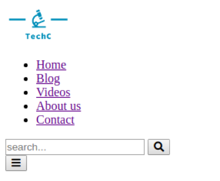
Now that we have our basic skeleton setup, we can begin with the actual meat of the project: the different responsive views. We’ll split those views up into 3 sections, using a mobile-first approach.
Step 1: Mobile view
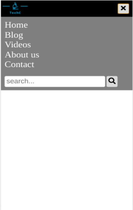
In general, mobile views consist of single-column layouts, and the navigation needs to be as unobtrusive as possible. Therefore, a common approach to the mobile view would be the hamburger menu, served as a dropdown list upon a user’s click. Also, since it’s a single-column layout, scrolling all the way towards the end of the page would take longer than if it was all in a compact, multi-column layout. So we’ll be making our navbar sticky, for easier access.
/* Remove some default styling*/
* {
  margin: 0;
  padding: 0;
  border: none;
}

.top_nav {
  height: 50px; /* Give navbar fixed height */
  background-color: black;
}

#nav_links,
#search_bar {
  display: none;
  background-color: rgba(0, 0, 0, 0.5); /* Transparent background */
  padding: 10px;
}
Firstly, I’ve added a small reset, so that some of the default styling from the browser doesn’t interfere with how we want it to look. The basic idea here was to give the navbar a fixed height, while hiding the search bar and navlinks for now. I added the background colors for the sole purpose of making the different sections distinctive.
Next, we’re styling the navlinks:
#nav_links li a {
  /* Remove underlines from links */
  text-decoration: none;
  color: white;
  font-size: 26px;
}

#hamburger {
  width: 30px;
  height: 30px;
  float: right;
  margin: 10px;
  font-size: 20px;
  border-radius: 4px;
}

#search_bar input,
#search_bar button {
  padding: 5px;
  font-size: 20px;
  border-radius: 4px;
}
The links themselves have typical styling: the removal of the underlines on the links, etc. For the hamburger button, we float it to the right. This will put it at the absolute right edge of the page, as there aren’t any obstructions. Then, we give it an absolute width and height of 30px and a margin of 10px. You could alternatively give it padding, instead of a width and height, but then the margin wouldn’t work as effectively. The margin is 10px right around because it will not only take it slightly away from the absolute edge of the page, but it will also vertically align the button! This is because the navbar itself has a height of 50px, so the 10px on top and the 10px on the right would give it some breathing space.
Finally, we added some styling to the search bar. I selected both the text field and the button for this. Notice that while we’ve added styling to the navlinks and search bar, they are still not visible!
Next, we add the code that implements the actual showing and hiding of the navlinks and search bar:
$(document).ready(function() {

    $("#hamburger").click(function() {
        // alternate between showing and hiding navbar
        $("#nav_links, #search_bar").toggle(1000);

       // alternate between bars and times
       $("#hamburger i").toggleClass("fa-bars").toggleClass("fa-times");
    });
});
For this to work, make sure that you’ve properly linked jQuery before you implement this code. Line 1 is a function that contains a built-in event listener for when the DOM loads. Then, on line 3 we have a click event listener for the hamburger button. You’d notice that jQuery generally follows that format, where “$(selector).functionName()” comes with a callback function as a parameter.
Nevertheless, we continue to line 4, where we’re calling the toggle function on the navlinks and searchbar respectively (notice how the selector syntax is the same as with CSS). The toggle function will take turns to hide and show the selected items, with the parameter being how long it takes to show and hide it in milliseconds. So it takes one second to fade in and out.
Line 5 is changing the bars icon to the times (a cross) icon, to show which button to click to hide the menu again.
That’s all we need for the mobile view, and it should look something like this:

Step 2: Tablet view
The advantage of using a mobile-first approach, is that you are minimising the amount of code you would have to rewrite for the other types of views. All that needs to change is the size and layout of the content. Tablet views can still make use of a single-column layout. In order to make your navbar responsive, you would wrap your view-specific code in a responsive media query, which is a declaration of what styling to apply to a specific view:
/* Tablet view starts here */
@media screen and (min-width: 780px) {

}
Don’t let the syntax scare you. All it means is that “when the width of the page is at least 700px, apply the following styling”. Within the media query, you would add:
.top_nav {
  display: grid;
  grid-template-columns: 1fr 1fr 2fr;
  color: blue;
}

#nav_links {
  position: absolute;
  top: 50px;
  width: 100%;
}

#search_bar {
  display: block;
  background: none;
}
You could have skipped the tablet view in favour of the mobile view for medium devices, but I’ve decided to keep the search bar on top (largely because of the extra space provided due to the viewport being wider).
Now we have 3 columns in the top_nav itself. I’ve used CSS-grids to position them. You can alternatively use any of the other technologies that handles positioning (‘Flex-box’, in particular, would stand out as an awesome alternative).
Due to the ordering of the elements in the html, this would put the navlinks in the third column, instead of the search bar. So I’ve used ‘position: absolute’ to make sure that it is placed below the navbar when it appears. This also removes it from the natural ordering of the elements. Also, the width is set to 100% to span the width of the page.
For the search bar, we’re simply making it visible again, and this would make it automatically be the third grid-item as defined in the “.top_nav”.
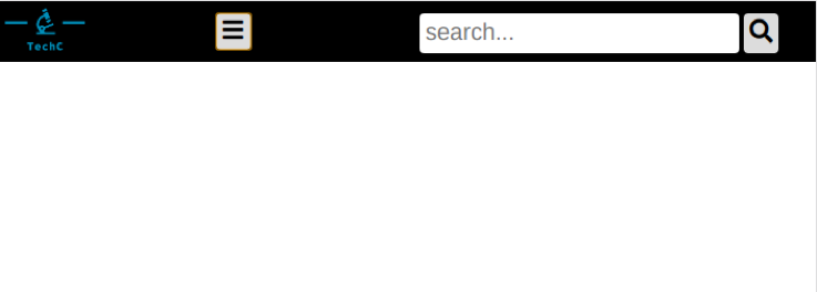
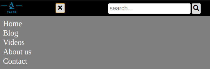
By now, you’d notice that the hamburger button isn’t working as expected, because both the navlinks and search bar still fade away when clicked. We would need to detect the device width when it reaches the tablet view, and ensure that only the navlinks are being toggled.
So we would add an if-else-statement to the original script such as below:
$(document).ready(function () {

  if (window.innerWidth <= 700) { // For mobile view
    $("#hamburger").click(function () {
      $("#nav_links, #search_bar").slideToggle(1000); //alternate between showing and hiding navbar
      $("#hamburger i").toggleClass('fa-bars').toggleClass('fa-times'); //alternate bars and times
      document.getElementById("nav_links").style.display = "block";
    });
  } else { // For tablet view and beyond
    $("#hamburger").click(function () {
      $("#nav_links").slideToggle(1000);
      $("#hamburger i").toggleClass('fa-bars').toggleClass('fa-times'); /    });
  }

});
This works because ‘window.innerWidth property’ holds the current width of the screen. By now you’d have something such as the below:
Now all that’s left is to round it off with the desktop view.
Step 3: Desktop view
Here, you’d use pretty similar code to the tablet view with one important difference (and a few less important differences):
The hamburger button itself will not be displayed, while the navlinks will. This is because the user would have a wide-enough screen for a proper multi-columned layout. The absence of the hamburger button and presence of the navlinks means that the navlinks will take up the extra column in the topnav’s layout code. Due to the natural ordering of the elements in the html code, the navlinks will be in the middle.
You’d also notice that the code for the navlinks would need some overriding, as the positioning was absolute in the tablet view. Also, the display would be set to ‘inline’ to keep with the general theme of making it fully horizontal.
I’ve added a simple hover effect just for some spice, and the code looks like the following:
/* Desktop view starts here */
@media screen and (min-width: 1200px) {
  .top_nav {
    display: grid;
    grid-template-columns: 1fr 4fr 2fr;
  }
  #hamburger {
    display: none;
  }
  #nav_links {
    display: block;
    position: relative;
    top: 0;
    width: 80%;
    height: 30px;
  }
  #nav_links li {
    display: inline;
    margin-right: 20px;
  }

  #nav_links li a:hover {
    border-bottom: 1px solid white;
  }
}
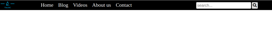
Your final desktop view would look something like this:
Closing remarks
So by now you likely have a working responsive top navigation menu on your site. From here, you can try your hand at customising it to have a different layout, better animations and transitions, etc. You would also have enough knowledge about responsive media queries by now to customise and make just about any web page responsive. Just note that converting a non-responsive webpage can often be more difficult than starting from scratch, so tread carefully there as not to break it.
The source code can be found here.
Happy coding 🙂
This post was written by Ridhaa Cupido, HyperionDev mentor and code reviewer.